 Leadership
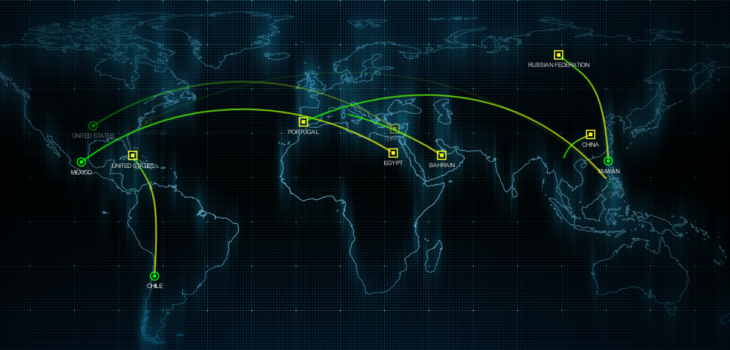
Ever want to be MORE cyber? Need to impress the board? Want to look 1337 AF? Worry not we have your back! Here is a collection of CYBER MAPS to project on your wall mounted displays!
https://cybermap.kaspersky.com/
https://threatmap.fortiguard.com/
https://threatmap.checkpoint.com/
https://botnet-cd.trendmicro.com
https://www.fireeye.com/cyber-map/threat-map.html
https://www.digitalattackmap.com/
https://www.imperva.com/cyber-threat-attack-map/
and for extreme lulz check out Threatbutt!
Summary
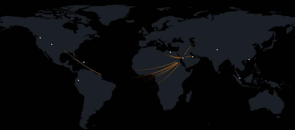
Pew Pew maps are fun but largely meaningless (not always, I look at source traffic destinations for various cyber incidents etc., what is useful is wall panes, charts, indicators, you know the kind of dashboard you would make in:
- Sentinel
- Splunk
- ELK
Or simply a network monitoring tool. Using a physical overlay can be useful but largely a graph, chart or panel will give far more meaningful data, they just don’t look as CYBER!
Pew pew map all you want (I mean I post them on twitter for fun!), just probably use them in transparency mode as a joke… otherwise people might get the wrong idea about your cyber knows!